Final Opening:
Thursday, 28 April 2016
Wednesday, 27 April 2016


Tuesday, 26 April 2016

Sunday, 24 April 2016

Wednesday, 20 April 2016
Coursework: Costume and Props

WARNING- the presentation may move too quickly for the writing so pause the auto play and manually click through the slides
Here is a shot of Adam in his final costume for our opening:

The outfit from the initial idea was a hoodie and jeans because he was just going to be a normal civilian but then when it came to the development of our storyline, the protagonist was of a high class and so we had to dress him accordingly.
Tuesday, 19 April 2016
Coursework: Brainstorming
Brainstorming after some discussion:
As a group we went away and did some research on different aspects that will concern our project.
Naomi looked into different make-up kits that we could use, to make the blood look realistic, and Adam looked at music and went over our plot again to check it over.
Adam raised some concerns such as casting, he pointed out that some of the people we were looking at casting (if they agreed) may not be reliable due to their studies and as they're not directly involved in a way that will affect their grades, they might not take our project as seriously as we would like them to. As a result of this, we have changed the story a bit so that there are less people involved to avoid as many issues regarding convening as a group. Maddie suggested that we use her little brother as he doesn't have as much pressure work wise due to him being in year 9 and it will be easy to liaise with him. The other character that we are casting is the supernatural creature herself, who, at the moment, we are considering Ella Venermo, a friend of Maddie's, but that may change. It could potentially be Maddie, for practical reasons.
One aspect of our storyline that we have altered is the bounty hunter. Instead of the bounty hunter being revealed at the end, to make it more mysterious, we are changing it so that it is a serious of P.O.V shots as the bounty hunter so that the audience get the feeling that the other characters are being followed. This has made it so that we don't have to worry about casting the hunter and adds a thriller effect to the story, as it has turned out to be more of a horror.
Maddie said that it turned out to be more of a horror because in thrillers blood is not a key feature as it is more of a genre that is more psychologically based, whereas horror is the blood and gore of the film industry. Maddie felt like that as a group that we would be able to have a better quality output if we are able to use a genre that has a wider range of codes and conventions available to use.

Coursework: Test footage
Lighting continuity has been a huge problem for our group. Our first two attempts at shooting were around 6 O'clock in the morning in late winter/early spring. Due to this, the sun rose quickly, and as you can see, the lighting changed dramatically over the course of our shooting.
 The make up of the ethereal girl is going to be developed because, as a group, we decided that the black veins were not realistic enough and looked almost comical.
I also asked some friends what they thought of the make up and what the first thing was that sprang to mind when they looked at it. They said she looked too humane to be supernatural, and that the 'veins' didn't actually look like veins at all, they reminded one person of a tree without all it's leaves, which is definitely not what we were aiming for.
 Taking this feedback into account, we are going to use white powder on all my showing skin, to give me a more sickly/dead look, and darken the eyes so that the white stands out. I am considering putting coconut oil in my hair as well to make it slightly darker and make it look less 'clean', for want of a better word.
As preciously mentioned, the location also needed improvement because Adam looked like he was being stalked, rather than a supernatural girl. As a result, we have changed location again to a grand house that a friend of Adam's family own, and we are going to attempt a haunted house style film opening. We are going to use similar concepts, in the sense that there is still a girl, except now the person acting her is me rather than Maya, as I have slightly longer hair.
 |
| This is a still from one of the first clips |
 |
| This is a still from a slightly later shot that we took |
We tried editing the footage to a similar colouring on the video editor but the product was a grainy image that we felt didn't professional enough for what we would like.
As a result we filmed again, in a different location at a slightly later time, but still in the morning. This time we had continuity issues with the frost that covered the grass in the earlier shots, and not in the later ones. We also had an issue with the fact the second location was not typical for a horror, and so the supernatural girl just looked like a weird stalker, and not a poisoned ethereal creature.
 |
| A still from one of the earlier shots, the ground has a slight grey coloration due to the frost |
 |
| Here you can identify that this is a later shot due to the frost having melted |
 |
| This is also one of the long shots that we took, it is evident that the location is not 'horror-like' enough |

I also asked some friends what they thought of the make up and what the first thing was that sprang to mind when they looked at it. They said she looked too humane to be supernatural, and that the 'veins' didn't actually look like veins at all, they reminded one person of a tree without all it's leaves, which is definitely not what we were aiming for.

As preciously mentioned, the location also needed improvement because Adam looked like he was being stalked, rather than a supernatural girl. As a result, we have changed location again to a grand house that a friend of Adam's family own, and we are going to attempt a haunted house style film opening. We are going to use similar concepts, in the sense that there is still a girl, except now the person acting her is me rather than Maya, as I have slightly longer hair.
Inspired by The Grudge, the girl will have her hair messier and slightly over her face, and, hopefully, white-out eyes. She will be in a white dress and at the moment we are undecided as to her footwear/if she will be wearing footwear.
The lighting in the second location was much too warm for the atmosphere that we were trying to capture. The first location had cooler colours, which was almost perfect for what we wanted, but the lighting continuity has prevented us from using this footage. Consequently, instead of filming in the morning, we are going to film later, around dusk, as this time carries many connotations associated with horror.
Written by Maddie Davies
Monday, 18 April 2016
Coursework: Mood
The main way that we wanted to create mood within our piece was by the use of lighting coupled with sound. On my own I did research into lighting that is usually used in horror films. I found that most horror films use lighting from underneath the character, this is done to highlight certain aspects of their bodies, or to show them as important. In shots which involve a set they frequently use lighting that appears quite natural but slightly distorted. Also known as Noir Lighting, it is known for its harsh that light that scams across the face, this helps imply mystery as it creates a lot of distinct shadows. This also implies a two faced nature as half of the character is covered.

An example of this type of underneath lighting was in The Blair Witch Project, in which teenagers were chased through a forest in one of the first, majorly successful, found footage films. The low key lighting creates an extremely dark and realistic look to the film.

A classic horror film, The Exorcist, uses a different type of lighting, the almost spotlight-like lighting used is linked into the films theme of religion, and how it plays a major factor in the films plot.
 |
We attempted to recreate the lighting that is common in most horror films, the blue tinge to the shots creates a depressive and dark atomsphere, often used in horror films to enhance the scenes and generate a larger response from the audience.

Another way that horror films create mood is through the use of music, both diegetic and non-diegetic. In films such as 'Psycho', directed by Alfred Hitchcock, the music that has been used has become iconic, instantly attributed to the horror genre. The high strings, fast paced music creates a sense of unease, increasing the audiences response to the film.

Many horror posters follow a similar set of motifs, with there often being a central image, or figure to instantly attract the focus of the audience. This is the coupled with the title of them film, against done in a typical horror manner to emphasise the type offilm it is going to be. The final signifier that is commonly used in horror posters is the use of red in the poster. The colour red itself is an extremely vibrant and attention grabbing colour, this alongside the connotations of violence or blood lets anyone that is viewing the poster know what type of film it is. Although these examples are posters, some signifies of genre used in them will be adopted into our own opening.
(this was all done by me and I've other members of my group use it as reference.)
Coursework: Iconic horror directors
Horror is a special type of genre as the director needs to be able to lead the audience into a false sense of security, then destroy their equilibrium in such a way that it gives the audience a physical and an emotional reaction.
 James Wan

Quote from Craven: "Horror films don't create fear. They release it."
Quote from Romero: "Reality is much worse than any stories about ghosts, zombies or aliens."

- Director of Saw, The Conjuring, Insidious
- James Wan has three 'trade marks', according to IMDb, those being: Ventriloquist dolls, backwards tracking shots and for frequently working with Leigh Whannel
- His inspiration: David Lynch, Dario Argento
Quote from Wan: "We think craft is important, and the irony has always been that horror may be disregarded by critics, but often they are the best-made movies you're going to find in terms of craft. You can't scare people if they see the seams."

Wes Craven
- Director of Scream, A Nightmare On Elm Street, The Last House On The Left
- Craven was known for his deformed and disfigured villains and his sadistically brutal killers
- Often used strong female characters, and his protagonists were usually normal people caught in the wrong place in the wrong time
Quote from Craven: "Horror films don't create fear. They release it."
- Director of the first ever zombie films, Night of the Living Dead, Dawn of the Dead, Day of the Dead, The Crazies, Creepshow
- Most known for introducing the genre of zombies into the mainstream, starting a sub-genre within horror that would influence culture for decades, and continues to do so
- Like, Craven, Romero's protagonists were usually normal people caught in the situation that they found themselves in.

Quote from Romero: "Reality is much worse than any stories about ghosts, zombies or aliens."
http://www.popmatters.com/post/176112-the-13-greatest-horror-directors-of-all-time/
http://www.imdb.com/list/ls051539272/
http://www.imdb.com/name/nm1490123/bio?ref_=nm_ov_bio_sm
Research done by Adam Cutler and Maddie Davies
Research done by Adam Cutler and Maddie Davies
Friday, 15 April 2016

Thursday, 14 April 2016
Coursework: Age Rating

We decided that our film would be most likely e classed as a 15. This is because we felt the full feature would contain to much content to be rated as a 12 or 12a, and there was not enough explicit material to be considered an 18. As well as this, the rating bracket that we decided on would still generate a large amount of profit at the box office, as it would not cut off the majority of cinema viewers.
Reasons why films are give the rating of 15
Any of the following:
- strong violence
- frequent strong language (e.g. 'f***').
- portrayals of sexual activity
- strong verbal references to sex
- sexual nudity
- brief scenes of sexual violence or verbal references to sexual violence
- discriminatory language or behaviour
- drug taking
The majority of horror movies have an age rating of 15 or over, this is due to the sustained, but mild, sexualised or sadistic content. This is exemplified by the gruesome special effects used to shock audiences, or the sustained themes that shock the average person. A film will become a higher rating once this threat of horror, sex or sadism becomes apparent and to an extreme degree.
The section about the reasoning for a film being a 15 was researched and done by Naomi Lee, the rest was completed on my own
Wednesday, 13 April 2016


Coursework: First and Second Draft of our Opening
Tuesday, 12 April 2016

Saturday, 2 April 2016
Monday, 7 March 2016
Wednesday, 24 February 2016
Thursday, 11 February 2016
Monday, 8 February 2016
Coursework: Studio Name and Design

The first thing that we looked into as a group was the idea of using a Celtic knot as the base for our studio symbol.Celtic knots are complete loops without any beginning or end. "The use of only one thread highlights the Celts' belief in the interconnections of life and eternity" we felt that this would be a intriguing idea to attach to our studio.

One of the inspirations for our studio design was the band, Breaking Benjamin's symbol. At the time, we had already had the idea of using Celtic knots, or something similar, as the base for our design.The design itself is simple, we especially liked the overlapping aspect to the design. we wanted the colour to either be black or white, to contrast against the colours on screen and to match with the text that would accompany it, like the title credits. Another aspect to this symbol that we liked as a group was its symmetry. This image only consists of simple geometric shapes or text. It does not meet the threshold of originality needed for copyright protection, and is therefore in the public domain.
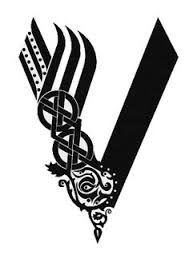
Another design that we looked at as a group was a viking symbol, which like the knot, represents life with one side being family and the other war. On one hand we liked the intricate designs and patterns, however we decided that it would be too hard to replicate and there was an issue of with the copy right of the design, as it has been used in the show, "Vikings," another reason why we decided against using it as as our final design would be that it would have been hard for us to add in the name that we opted for, as it would have had to have been up the side of the symbol.
STUDIO NAME: Our final decision on a studio name was "Sator Studio" with the word "Sator" meaning creator in Latin. We felt that this was a good name as it was an alliteration and sounded appropriate for a film production company.
Final Design:


Sunday, 17 January 2016
Coursework: Title Sequence

Friday, 1 January 2016
Development of Genre: Thriller
As a group, Naomi, Maddie and I chose to explore the genre of thriller. This research will help us with our coursework as we intend to involve an enigmatic element to our film opening. Genre relies on signs, signifiers, and signifying practices, and this is what will be explored to see how 'thriller' is presented as a genre.
What is a thriller?
A thriller is usually a conflict between a protagonist and an antagonist. A film labelled 'thriller' tends to have a series of unfortunate events that build tension and lead to a climax. Thriller films are also liable to involve disruption of an equilibrium, and include justice in some way, most likely with the protagonist trying to save it, and the antagonist trying to destroy it.


History of Thriller
-1920s-1930s-
· 1926- Alfred Hitchcock “The Lodger”. Jack the Ripper, suspense.
· 1929- Hitchcock “Blackmail”
· 1935 onwards- Majority of Hitchcock’s outputs= thrillers.
· 1928- Fritz Lang “Spies”- Projected the James Bond films of the future.

· 1931- Fritz Lang “German Film”- serial killer Peter Kurten and his life.
· 1933- Edward Sutherland “Murders in The Zoo”.
· NOTABLE BRITISH DIRECTORS: Walter Forde, Victor Saville, George A, Cooper and the young Michael Powell.
-1940s-
· 1940- Hitchcock, suspense thrillers: “Rebecca”, “Foreign Correspondent”
· 1941- “Suspicion”- women in danger of her own husband.
· 1942- “Saboteur”
· 1943- “Shadow of a doubt”, Hitchcock’s personal favourite- based on a true case of a 1920s serial killer known as The Merry Widow Murderer.
· 1944- Psychological thriller “Gaslight”- husband who plotted to make his own Wife go insane in order to inherit her inheritance.
“Noir”- thrilling murder investigation made by police detective.

· 1946- “The Spiral Staircase”
· 1948- “The Lady from Shanghai”, “Sorry, Wrong Number”
· 1949- “The Third Man”
-1950s-
· 1950- Hitchcock, “Technicolor”.
· 1951- Classic film “Strangers On A Train”, staged battle of wits and traded murders with each other.

· 1953- “Niagara”- Henry Hathaway
· 1954- “Dial M for Murder”, about a husband who attempted to murder his wife. “Rear window”- about a man who was convinced his neighbour was a killer.
· 1955- “To Catch a Thief”, “Kiss Me Deadly”, “The Night of The Hunter”
· 1958- “Vertigo”, “Touch of Evil”
-1960s-
· 1960- “Peeping Tom”- psychopathic cameraman- released prior to “Psycho” (1960) - about a loner and a mother fixated motel owner.
· 1962- “Cape Fear” J Lee Thompson- featured a menacing character seeking revenge.
· 1963- “Charade” Stanley Donens- numerous plots and twists starring a pair of characters on the search for hidden loot which takes them to Paris.
· 1965- “Repulsion” Roman Polanski, English- frightening and surrealistic, featured a young woman who goes increasingly mad.

· 1967- “Wait Until Dark” Terrence Youngs- famous thriller of its release date, about a victimized blind woman in her Manhattan apartment and an evil con man in search for drugs.
· Harry palmer Spy trilogy were inspired by 007.
- “The Spy who Came In From The Cold” 1965.
- “The Deadly Affair” + “The Triple Cross”- 1967.
-1970s-1980s-
· 1971- “Duel” , Steven Spielberg, low budget TV movie.

· This period brought the first film about an individual being disturbingly obsessed with their idol. Clint Eastwood’s “Play Misty for Me”
· 1972- Hitchcock, “Frenzy” first British film in almost two decades, given “R” rating for its explicit content. “Deliverance”, John Boorman.
· 1973- “Don’t Look Now”, Nicolas Roegs, macabre- a tale of despair in Venice as a couple grieving the death of their daughter. Brian De Palmas psycho-thriller “Sisters”.
· 1974- “The Conversation” Francis Fords Coppolas (tense thriller).
· 1978- “The Eyes of Laura Mars”
· 1980- “Dressed to kill”
· 1981- “Blow Out”
· 1987- “Body Double”
-1990s-Present-
· 1990- “Misery” Rob Reiners, based on a book by Stephen King.
· 1991- “Sleeping With The Enemy”. “The Silence Of The Lambs”- Jonathan Demme- where a young FBI agent is in a psychological war against a cannibalistic psychiatrist.
· 1992- “The Hand That Rocks The Cradle”, Curtis Hanson- about a nanny who was seeking revenge against her dead husband.

· 1995- “se7en”, David Fincher- about a search for a serial killer who conducted the seven deadly sins.
· 2001- “Joy Ride”.
· 2005- “Hostage”, “A History of Violence”.
· 2006- “Cellular”, “Firewall”.

· 2007- “Captivity”, “P2”.
· 2008- “Eden Lake”, “Funny Games”.
· 2009- “The Last House on the Left”.
· 2011- “Unknown”.
1990's
The Silence of the Lambs (1991)

The colour scheme is a stark black-and-white with highlight of brown and yellow. This also subverts from the modernised norm of red undertones, suggesting that before the 'naughties', the colour scheme associated with thriller films was of a similar essence. The significance of a death's-head hawk moth over the mouth of the victim is important as that particular moth itself carries connotations of death, and the title is of burnt orange colour, encouraging the notion of predators and prey. This idea emphasises the plot which includes psychopathic serial killers and an F.B.I agent, who is cast as a female, consequently being portrayed as a vulnerable character. The face in the background is lit from one side, resulting in the shadows being harsher on the right-hand side, implying that the unnamed person could schizophrenic, which is common amongst the 'bad guys' as they are less predictable.
Leon (1994)

The black background implies a sinister aspect to the film, and the juxtaposition of the white man drawn abstractly implies that this character prefers things simple and clear. It could also be inferred in the sense that because he is an assassin, he cannot afford to go wrong, demonstrated by the sharp contrast and lack of blurred lines/shading.The title is in bold, capital letters bar the letter 'n', which is in lower case; this may indicate that even though everything about the characters lives appears to be in order, there is still the twist of the orphaned girl learning to be an assassin, which is not normal, therefore being a disruption of the equilibrium. This further heightens the thrill and fear that is induced in the audience by the idea of emotionless psychopathy due to the girl and the man looking at the gun in a nonchalant way in the top right corner. Apart from this screenshot, the only other colour on the poster is the word 'Leon', which is in a dull yellow colour, subverting from the typical red highlights that are used in thriller films.

The cool colour scheme and the elongated shadows imply a mysterious element to the film. The faces of the main three characters are pictured in the top half of the film art and they are arranged in a slanted triangular formation, which may indicate a hierarchy amongst those three characters. The man on the right of the three is wearing sunglasses, suggesting that he does not want his identity known, that he wants to blend in with the crowd, and this supports his character as Robert De Niro plays Neil McCauley, who is the head of the criminal crew.The title is of the same sort of colours as the background but it is underlined in red, consequently emphasising it which may imply imminent danger. The five silhouetted figures are stood in a falsely relaxed manner as they are obviously on edge, best represented by the figure on the far left who is looking over his shoulder.
2000's

Momento (2002)
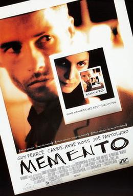
The poster for the thriller film, 'Momento' show a series of photos inside of each other in a cyclical way. This element of the poster adds to the storyline given and suggests a way that the main character overcomes his lack of short term memory and inability to create new ones. The photos are set at a dutch angle, implying a sense of disorientation that may be a reoccurring feature throughout the film. The photos have been filtered so that there are no cool colours involved, with burnt oranges being the main colour. This can be associated with action and a fast paced storyline. In order to make the title stand out, the creator of the poster has used a font which looks like it could be someone's handwriting and is in all capitals, making it even more noticeable as this tends to be identified with anger, panic or just someone trying to emphasise a certain point.
The Departed (2006)

'The Departed' uses a slightly different technique to draw in the audience; it uses a black background and the only image is inside the text of the main title. The text shows close up shots of faces of three men, all with intense facial expressions and the colours are cooler in the images. There are, however, connotations of red which signify danger and blood which may foreshadow events in the film. The title is also repeated on the poster, once in large, block-capitals filled out with coloured images, whereas the other time it appears on the poster is in a plain white, clearer text which is smaller than the other title, but is still larger than the 'fine print'. The text is has no clear layout and is broken up in some places, suggesting that the film is quick and shows an element of uncertainty which is then juxtaposed by the style of the text.
Inception (2010)

The poster for the film, 'Inception' is made up of entirely cool colours, bar the title of the film which is in red. The red has connotations of danger and death, and the simple, capitalised text adds to the atmosphere of fear and the task that the main character has to complete is as far from simplicity as it can get. The background of the media text is a city which appears to be folding in on itself, giving the audience a hint as to what challenges the characters have to face. Having Leonardo DiCaprio as the main character, made clear by him being stood centre shot and the light source coming from behind him, is a good selling point as he has a large fan base and is known to be associated with romance or action films and by looking at this film poster, the audience can tell it is not primarily a romantic story.
The Grey (2011)

This film poster stays relevant to the title when regarding the colour as the colours are slightly washed out, giving it an overall greying effect. The image in the background is a close up of the main character with a determined expression on his face. The injury on the character's face induces the idea of a thriller as it contrasts the rest of the colours dramatically. The text is of a whit, block-capital style which is harsh against the background image, consequently drawing attention to the title. Underneath the main title of the film there is a caption, "live or die on this day", and this provokes the audience into thinking about the film in further detail. This caption also is an exposition for the film, resulting in the audience being on edge and expecting the worst the whole way through the film.
Subscribe to:
Comments (Atom)